Read more about the article 60 • Smoke and Mirrors
Smoke and Mirrors

60 • Smoke and Mirrors

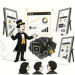
Smoke and Mirrors describes deceptive, misleading, or heavily embellished information used to disguise an unpleasant truth or make something appear better than it is. In UX design, smoke and mirrors refers to design illusions such as high-fidelity prototypes or deceptive micro-interactions that make a product feel highly functional, responsive, or simple on the surface while masking deep back-end complexity or missing features.


Continue Reading60 • Smoke and Mirrors
Read more about the article 58 • Bells and Whistles
Bells and Whistles

58 • Bells and Whistles

Bells and whistles are non-essential, flashy features or embellishments that enhance a product's appeal but are not required for core functionality. While sometimes adding delight or immersion, they often risk obscuring core user needs, leading to increased complexity, cognitive load, and reduced usability. In UX design, bells and whistles may refer to elaborate animations, unnecessary 3D effects, or complex customization options that make the interface sparkle, the interactions feel fancy, and the feature list sounds exciting - but do little to enhance the core experience.

Continue Reading58 • Bells and Whistles
Read more about the article 54 • Data–Ink Ratio
Data-Ink Ratio

54 • Data–Ink Ratio

Data ink refers to the ink (or pixels) that represents the actual data in a visualization. The Data-Ink Ratio measures the proportion of ink used to represent data compared to the total amount of ink used in the graphical presentation, including non-data elements. In visual design, it is therefore essential to prioritize increasing the data-ink ratio by utilizing data ink exclusively and minimizing or eliminating non-essential ink. By doing so, the focus remains on the data rather than unnecessary or decorative design elements such as gradients, shadows, borders, labels, widgets, or enthusiastic gridlines.

Continue Reading54 • Data–Ink Ratio
Read more about the article 51 • Gold Plating
Gold Plating

51 • Gold Plating

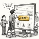
Gold Plating is a term that means working on a project or task past the point of diminishing returns. It refers to the practice of adding extra features or "polishing" designs beyond the agreed scope without measurably increasing quality. In UX, designers sometimes try to improve the look and feel with the desire to exceed expectations, often not realizing that their extra effort doesn't add real value to the user experience. Instead, it introduces unnecessary cost and potential technical debt as these extras take time and go undocumented.

Continue Reading51 • Gold Plating
Read more about the article 44 • Red Herring
Red Herring

44 • Red Herring

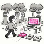
A Red Herring is a misleading or distracting element that pulls attention away from what actually matters. In UX, it can be accidental such as a design element that looks like it does the thing but doesn’t, something that distracts users from their primary goal or leads them toward the wrong conclusion. But it can also be intentional, such as a deliberate distraction used to test attention or a research question to validate that users don't rush through the study.

Continue Reading44 • Red Herring
Read more about the article 41 • Kitchen Sink
Kitchen Sink

41 • Kitchen Sink

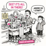
The Kitchen Sink is what happens when an app - or a map - tries to show everything and ends up explaining nothing. At first glance, it looks impressive. Packed. Comprehensive. Full of features, layers, and information. But spend more than a few seconds with it, and the experience quickly shifts from insight to overload. The eye jumps. The interface competes for attention. The meaning gets buried somewhere between panels, controls, and colors. The Kitchen Sink is not a failure of effort. It is a failure of prioritization.

Continue Reading41 • Kitchen Sink
Read more about the article 10 • Uncanny Valley
Uncanny Valley

10 • Uncanny Valley

The “uncanny valley” is that unsettling gap between almost human and human. In UX and product design, it’s the moment when something looks realistic enough to trigger our expectations for real-world behavior, but falls just short, creating discomfort instead of delight. Think avatars with glassy eyes, chatbots with suspiciously human typing pauses, or “realistic” micro interactions that feel off in a way you can’t quite name.

Continue Reading10 • Uncanny Valley
Read more about the article 08 • Empty Fridge Syndrome
Empty Fridge Syndrome

08 • Empty Fridge Syndrome

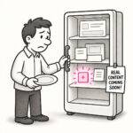
Empty Fridge Syndrome describes the disappointing experience users have when they first open a newly installed app or sign in to a new product, only to find… nothing. No data, no guidance, no value. Just an empty, cold interface waiting for them to figure out what to do next. The app looks polished from the outside, but when you “open it up” (the fridge), it’s empty or filled with placeholders.

Continue Reading08 • Empty Fridge Syndrome
Read more about the article 07 • Lorem Ipsum Trap
Lorem ipsum trap

07 • Lorem Ipsum Trap

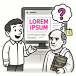
The Lorem Ipsum Trap refers to the mistake of designing and evaluating interfaces with placeholder text, like the classic “lorem ipsum” filler, instead of realistic, meaningful content. It’s what happens when designs look polished in mockups but break down when confronted with the messy, unpredictable reality of actual user content.

Continue Reading07 • Lorem Ipsum Trap