The Streisand effect is a phenomenon where attempts to suppress or hide information inadvertently cause it to spread more widely, often creating the opposite of the intended effect.
In UI design, attempts to obscure, bury, or quietly remove something often do the opposite – they draw attention to it. What users might never have noticed suddenly becomes the thing they focus on.
ORIGIN
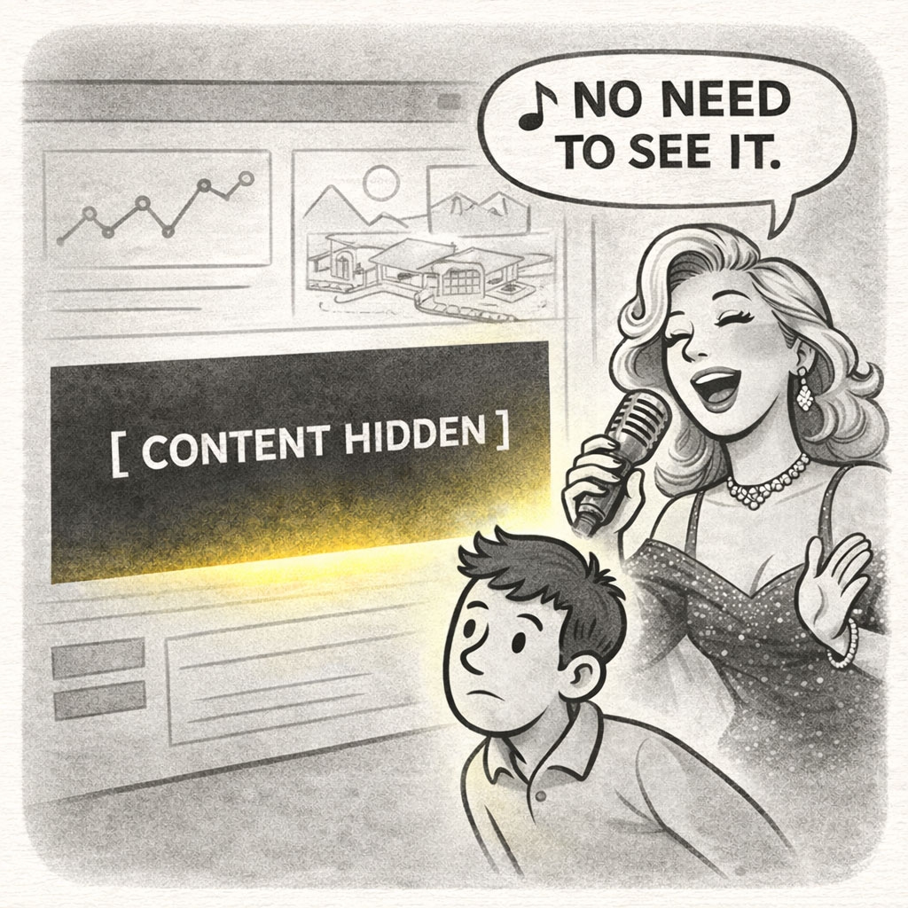
The term comes from an incident involving Barbra Streisand, an American singer and actress, who attempted to have an aerial photo of her Malibu home removed from a public archive for privacy reasons. Before the attempt, the image had only been downloaded six times. Afterward, the image received over 400,000 views in a month. The effort to hide the image became the reason it see it.
The act of suppression itself becomes the signal, thinking that “if something is hidden, it must be worth seeing.”
WHEN
You’ve encountered the Streisand Effect in UX when:
- A feature is quietly removed – and suddenly users demand it back
- Important information is buried – and users start searching for it
- A limitation is hidden – and becomes a point of frustration
- A change goes unexplained – and users speculate
- Someone says: “Users probably won’t notice”
If hiding something becomes noticeable, it becomes important.
WHY
The Streisand Effect is driven by attention and trust. The following situations may indicate its presence:
- Hidden things attract attention: When users sense something is being obscured, curiosity increases.
- Users resist loss of control: If something changes without explanation, users investigate.
- Absence becomes a signal: What’s missing can be more noticeable than what’s present.
In interfaces, silence isn’t neutral. User will notice and start interpreting its meaning, valid or not.
HOW
The Streisand Effect cannot be prevented by better hiding, that’s the root cause for the problem in the first place. Instead, try doing the following:
- Be explicit about change: If something is removed or altered, acknowledge it. Silence invites speculation.
- Make limitations visible and understandable: Clear constraints build trust. Hidden ones erode it.
- Don’t bury important information: If users need it, surface it where it matters – not three layers deep.
- Align visibility with intent: If something matters, it should be easy to find. If it doesn’t, remove it – don’t disguise it.
PRO TIP
This tip is as simple as it sounds: Don’t try to hide what users will inevitably discover.
EXAMPLES
The following examples of the Streisand Effect showcase the effects they may have on users:
- Removing a commonly used feature without explanation → user backlash
- Hiding important details behind multiple steps → increased drop-off
- Softening a limitation instead of stating it clearly → confusion
- Trying to quietly change behavior → users notice and question it
- Burying critical information → users assume the worst
CONCLUSION
In user interfaces, the Streisand Effect reveals a simple truth: the absence of something may reveal the presence of something else, even if it’s only about what users feel is being hidden.
Trying to reduce attention often increases it. Trying to avoid friction often results in distrust. Good design doesn’t rely on concealment, rather it relies on clarity. Because the fastest way to make something stand out… is to try to hide it.


