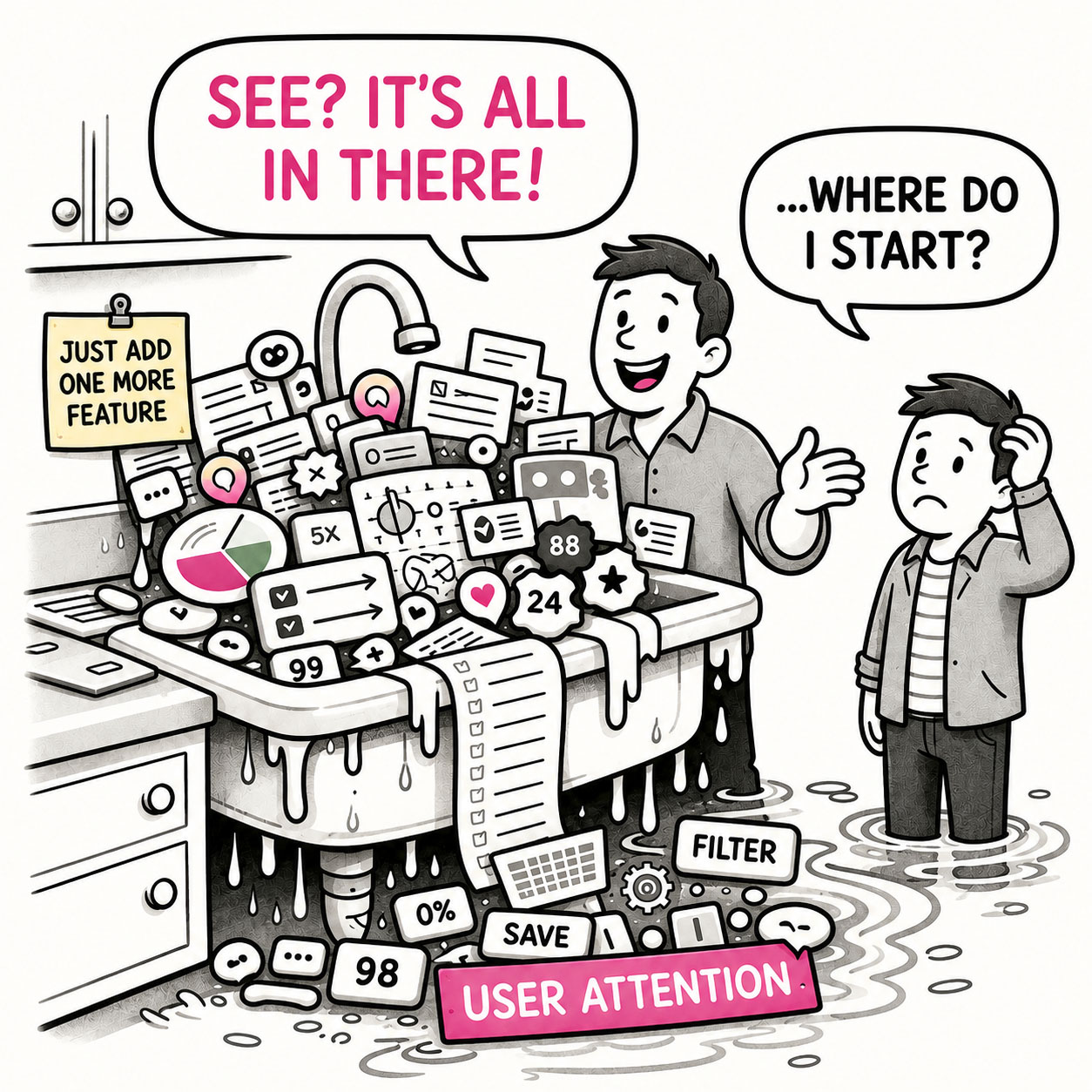
The Kitchen Sink is what happens when an app – or a map – tries to show everything and ends up explaining nothing.
At first glance, it looks impressive. Packed. Comprehensive. Full of features, layers, and information. But spend more than a few seconds with it, and the experience quickly shifts from insight to overload. The eye jumps. The interface competes for attention. The meaning gets buried somewhere between panels, controls, and colors. The Kitchen Sink isn’t usually a failure of effort. Quite the opposite; a great deal of work went into making sure nothing was left out. The problem is that nobody made the uncomfortable decision about what mattered most.
ORIGIN
The term Kitchen Sink comes from the idiom “everything but the kitchen sink,” meaning almost everything imaginable has been included.
The phrase dates to the late 19th century, when it originally appeared as “everything but the kitchen stove.” By the early 20th century, it evolved into the “sink” version – likely because the phrasing was more rhythmic and memorable. A 1918 newspaper already described people fleeing with “everything but the kitchen sink.”
Later, the phrase transitioned into business and product thinking, where it came to represent the tendency to include every possible feature or option. In modern UX, the Kitchen Sink is mostly used to describe an anti-pattern – interfaces that try to include everything, and in doing so, lose clarity.
WHEN
A clear tell-all moment to identify a Kitchen Sink is when the interface or map requires explanation before it can be used. Furthermore, you’ll encounter the Kitchen Sink in apps or maps when:
- You hear: “We need to show all of this.”
Nobody has established why. Apparently existence is sufficient qualification for visibility.
- Everything is important
Every feature deserves prominence and every dataset needs its own vibrant color.
- Features accumulate “just in case”
Someone, somewhere, might eventually need it. We better give it permanent screen space, right?
- The interface requires a guided tour
Before users can accomplish anything, someone needs to explain where everything lives.
- Nothing is allowed to recede
Primary actions, secondary tools, alerts, navigation, and supplementary information all compete at roughly the same volume.
- Removing anything becomes political
That widget isn’t just a widget anymore. It belongs to a team.
- You hear: “But everything is there.”
Technically correct. So is everything in a junk drawer.
WHY
The Kitchen Sink isn’t usually caused by bad design. It’s mostly caused by avoided decisions and the following:
- Prioritization is difficult
Choosing what matters means deciding what matters less. Adding everything avoids that conversation entirely.
- Stakeholders accumulate
Every feature represents a request, team, dataset, customer, or business priority. Removing something can feel like removing someone’s importance.
- Omission feels dangerous
Teams worry that hiding functionality will reduce capability, so everything remains visible “just to be safe.”
- Completeness gets confused with value
More features, data, and controls can make a product look powerful. That doesn’t necessarily make it easier or more useful.
- Adding is easier than removing
Modern tools make another panel, layer, widget, or setting remarkably cheap to add. The cognitive cost is paid later by the user.
HOW
The solution isn’t minimalism for its own sake. Complex products can remain complex. The goal is to make that complexity understandable.
- Decide what matters most
Identify the primary user goals and make the interface reflect those priorities.
- Design useful defaults
Don’t make users configure the product before they can understand it. Start with the information and functionality most people need.
- Use progressive disclosure
Show essential controls first and reveal advanced capabilities when they’re relevant.
- Group related functionality
Structure complexity rather than simply exposing it. A hundred capabilities don’t necessarily require a hundred visible controls.
- Let secondary elements recede
Not everything deserves equal visual weight. Hierarchy tells users where to start.
- Remove before adding
When another control arrives, consider whether something else can disappear, combine, or move deeper into the experience.
PRO TIP
If everything is important, nothing is. Design for clarity, not completeness. But most importantly, challenge “just in case” requests. Ask who needs the feature, how often, and whether permanent visibility is really necessary.
EXAMPLES
- A GIS dashboard opens with every available layer turned on by default.
- An app displays charts, filters, maps, tables, alerts, and KPIs simultaneously, all competing for attention.
- A toolbar contains dozens of icons with roughly equal visual prominence.
- A settings page exposes every advanced option instead of providing sensible defaults and progressive disclosure.
- A map assigns a bright, distinctive color to every dataset because every dataset needs to “stand out.”
- A homepage keeps accumulating cards because every department wants its content above the fold.
- A legend becomes so long that users need to scroll through it to understand the map.
CONCLUSION
The Kitchen Sink reminds us that inclusion is not the same as clarity.
Good products make decisions on behalf of their users. They establish priorities, provide sensible defaults, create hierarchy, and reveal complexity when it becomes useful. They don’t necessarily remove powerful capabilities – they prevent every capability from demanding attention at the same time.
The Kitchen Sink does the opposite. It preserves every request, every feature, every dataset, and every stakeholder priority, then hands the resulting collection – and the burden – to the user. Everything is technically there, except one thing, the point of it.