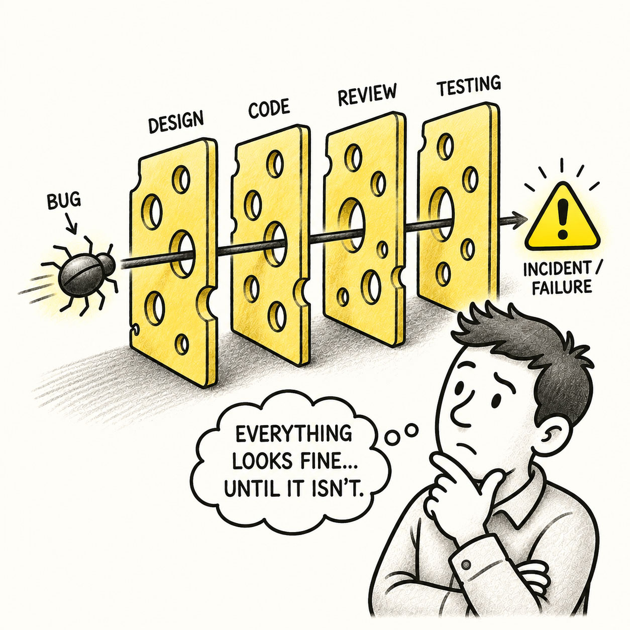
The Swiss Cheese Model helps explain why accidents happen, often despite all our best intentions. It occurs when multiple small flaws line up perfectly to create a large failure. What appears to be a sudden disaster is usually the result of many small imperfections quietly accumulating.
In product design, the Swiss Cheese Model appears when several minor design weaknesses combine to create a serious user problem. A confusing icon, an unclear label, a missing confirmation dialog, and a lack of undo functionality might each seem harmless on their own. But altogether, they can guide a user straight into a costly mistake such as deleting data, submitting incorrect information, or triggering an irreversible action.
ORIGIN
The Swiss Cheese Model was introduced in the 1990s by psychologist James T. Reason to explain how accidents happen in complex systems. The memorable visual metaphor of a Swiss cheese serves as an illustration of this principle. Multiple slices are stacked side by side and represent the layers of protection. Each slice includes randomly distributed holes representing the weaknesses or vulnerabilities of varying sizes in the layers.
Individually, the holes are harmless. But when the holes across several slices line up, a failure can pass through every layer. As a result, sudden and unexpected accidents appears due to the product of many small imperfections.
WHEN
The Swiss Cheese Model occurs more frequently in organizations that rely heavily on layers of review, approval, and validation. The following factors increase the likelihood of errors to happen:
- Several small problems combine into one big problem
None seems particularly dangerous until they’re experienced together.
- Every safeguard almost works
The warning exists but isn’t clear. The confirmation exists but looks routine. The validation exists but misses this particular case.
- A failure survives multiple reviews
Design reviewed it. Engineering reviewed it. QA tested it. The user still found the hole.
- Responsibility is spread across teams
Everyone owns one slice but nobody owns the path through all of them.
- Minor issues are repeatedly accepted
“We can fix that later.” Eventually, later develops quite an impressive collection.
Common industries that are affected include aviation, healthcare, engineering, cybersecurity, product design, and software development.
WHY
There are many reasons for unexpected errors to happen. Most of the time, these holes don’t matter, but occasionally, they align. When they do, the system’s defenses quietly disappear. Examples include the following:
- Humans make mistakes
Users misunderstand things, designers overlook things, developers introduce bugs, and reviewers miss them.
- Safeguards have weaknesses
Confirmations, validation, permissions, warnings, testing, and reviews reduce risk, but none can eliminate it completely.
- Small problems appear harmless in isolation
A slightly confusing label rarely feels urgent enough to stop a release.
- Complex systems create dependencies
A weakness in one place may only become dangerous when combined with a completely different weakness elsewhere.
- Responsibility becomes fragmented
Design owns the interface. Engineering owns validation. QA owns testing. Operations owns monitoring. The failure politely travels between them.
HOW
The goal isn’t to build a system without holes. That’s unrealistic. The goal is to prevent a single path from passing through all of them. Consider the following:
- Find the dangerous combinations
Don’t evaluate problems only in isolation. Ask what happens when this weakness encounters elsewhere.
- Prioritize by magnitude of consequence
A tiny usability problem in a destructive workflow may deserve more attention than a highly visible annoyance with harmless consequences.
- Make critical layers strong
More safeguards aren’t automatically better. A clear constraint can be more effective than three warning dialogs everyone ignores.
- Design for recovery
Undo, version history, autosave recovery, reversible actions, and sensible defaults can stop a mistake from becoming a disaster.
- Test the whole journey
Individual components can work perfectly while the end-to-end experience fails spectacularly.
PRO TIP
Do not assume safety comes from adding more layers. Instead, focus on closing holes in critical layers. The strongest systems do not rely on many protections, they rely on clear, resilient ones.
EXAMPLES
- A user deletes important data because the delete icon is ambiguous, the confirmation message vague, and there is no undo.
- A misleading map makes it through review because the data classification is flawed, the color scheme exaggerates the pattern, and the legend is ambiguous.
- A user submits incorrect information because the input accepts an unexpected format, validation doesn’t catch it, and the review screen hides the mistake.
- A payment is accidentally submitted twice because the button provides no feedback, the system responds slowly, and nothing prevents a duplicate transaction.
- A dangerous setting is changed because the control is poorly labeled, permissions are too broad, and there is no confirmation or rollback.
CONCLUSION
Failures rarely happen because of a single mistake. They happen because systems quietly accumulate small weaknesses.
Good product design assumes that users will misunderstand things, software will misbehave, requirements will be incomplete, and teams will occasionally miss something. Resilient systems don’t depend on everyone getting everything right. They provide multiple opportunities to prevent mistakes, detect them, and recover when they inevitably happen.