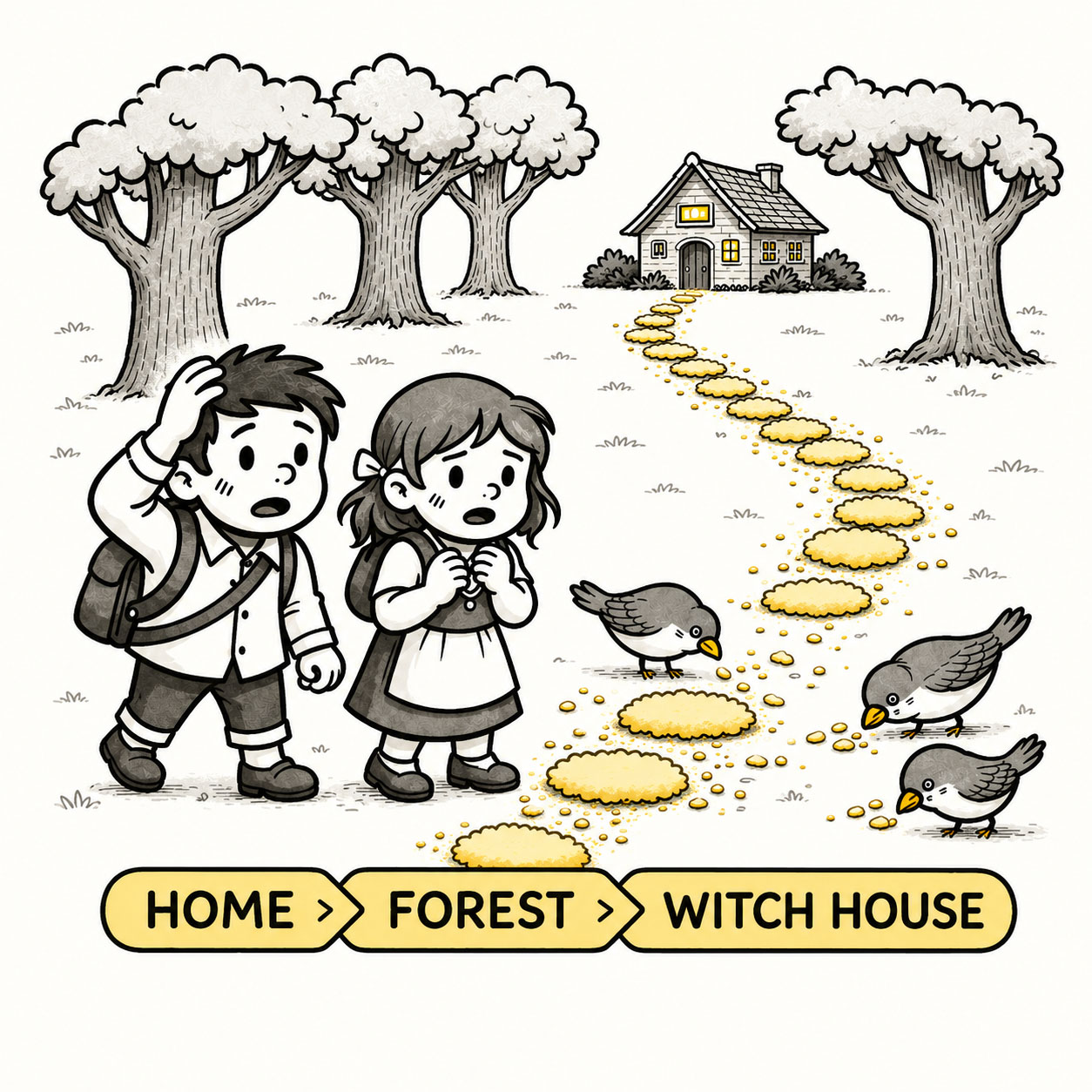
Breadcrumbs are the quiet little trail that tells users where they are, where they sit within a larger structure, and how to find their way back – without feeling lost in the woods.
In UX, breadcrumbs provide orientation without demanding attention, showing a clear trail through complex structures such as websites, apps, and map interfaces. They are a simple but powerful navigational aid that supports orientation, hierarchy, and confidence.
ORIGIN
The name breadcrumbs comes from the fairy tale Hansel and Gretel, famously collected and published by Jacob and Wilhelm Grimm in the early 19th century. The brothers drew inspiration for the story during the early 1800s from the family of Wilhelm’s friend and future wife, Dortchen Wild, and partly from other sources. The original tale most likely emerged much earlier than that, during the late Middle Ages (1250-1500) in Germany.
In the story, Hansel and Gretel are the young children of a poor woodcutter. When famine settles over the land, the woodcutter’s second wife tells him to take the children into the woods and leave them there to fend for themselves. To find their way home, Hansel leaves a trail of white pebbles behind, which outraged the stepmother who locks the pebbles away in days to come and forces the father to walk the siblings deeper and deeper into the forest. Instead of pebbles, Hansel uses breadcrumbs from their ration of food to mark the way. While the breadcrumbs are ultimately eaten by birds in the story, the metaphor endured – representing a navigational trail through unfamiliar territory.
In digital design, breadcrumbs emerged alongside early websites in the 1990s as a way to help users navigate increasingly complex information architectures. As websites and applications grew in depth and sophistication, breadcrumbs became a standard navigation pattern, particularly in hierarchical systems such as e-commerce, documentation, and enterprise platforms. Today, breadcrumbs remain a cornerstone of usability, providing context, orientation, and efficient navigation across web, mobile, and map-based experiences.
WHEN
Breadcrumbs are particularly useful in the following situations:
- Content has a clear hierarchy
Products belong to categories. Documents belong to sections. Places belong to regions.
- Users navigate several levels deep
The deeper the structure, the easier it becomes to lose sight of the bigger picture.
- Users arrive through a side door
Search engines, bookmarks, shared links, and notifications can drop someone directly into level five without introducing levels one through four.
- You hear: “Where am I?”
A surprisingly expensive question for an interface to leave unanswered.
WHY
Breadcrumbs reduce cognitive load by providing contextual awareness and navigational shortcuts. They help users understand their position within a structure without requiring them to rely solely on memory or the back button.
Key benefits include the following:
- They provide orientation
Breadcrumbs show the current location in relation to the larger information structure.
- They reveal hierarchy
Users can see how content is organized without opening menus or memorizing the site’s architecture.
- They provide shortcuts
Instead of repeatedly pressing Back, users can jump directly to a meaningful parent level.
- They reduce cognitive effort
The interface remembers the structure so the user doesn’t have to.
- They support unexpected entry points
Even when someone arrives directly on a deeply nested page, breadcrumbs provide immediate context.
- They encourage exploration
Understanding the surrounding structure makes it easier to move around confidently.
HOW
Breadcrumbs are usually displayed as a horizontal trail near the top of the content, separated by a visual delimiter such as “>” or “/”.
Example:
Home > Products > Electronics > Cameras > Mirrorless
Design considerations:
- Represent hierarchy, not browsing history
Unlike Hansel and Gretel, breadcrumbs usually describe where the current content lives, not every page the user happened to visit on the way there. The browser already has a Back button.
- Use meaningful labels
Each level should clearly describe its place in the structure.
- Make parent levels interactive
Users should be able to jump directly to higher levels without navigating backward one page at a time.
- Make the current location clear
The final item represents where the user is now and generally doesn’t need to link to itself.
- Keep the trail concise
Breadcrumbs provide context, not a complete autobiography of the page.
- Use them as secondary navigation
Breadcrumbs complement good primary navigation. They aren’t a convenient excuse for not having any.
PRO TIP
Breadcrumbs guide users home, making sure the path is clear, consistent, and meaningful.
EXAMPLES
- An e-commerce site shows Home > Men > Shoes > Sneakers above a product.
- A documentation portal shows the section and subsection containing the current article.
- An enterprise application uses breadcrumbs to clarify a deeply nested administrative hierarchy.
- A map interface shows World > Europe > Austria > Salzburg as users explore geographic levels.
- A user jumps directly from a product page to its parent category without repeatedly pressing Back.
CONCLUSION
Good breadcrumbs quietly provide orientation, reveal structure, and offer a way upward without competing with the content users actually came to see. They make complex environments feel more understandable while asking very little attention in return.
A well-designed interface lets users explore freely without fear of getting lost. Breadcrumbs make that freedom possible – one step at a time.