Vibe Coding
56 • Vibe Coding
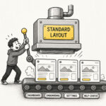
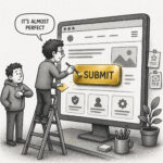
Vibe Coding is a software development practice assisted by artificial intelligence (AI) where the developer describes the outcome through prompts, trusting that the system will figure out the rest. Instead of carefully designing solutions, you prompt, generate, test, tweak, and repeat. The software begins to take shape quickly, features appear almost instantly, and progress feels effortless. It's tempting to rely on results and follow-up prompts to guide changes whilst accepting AI-generated code without thorough review.