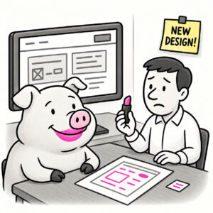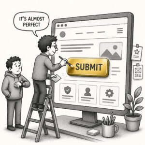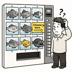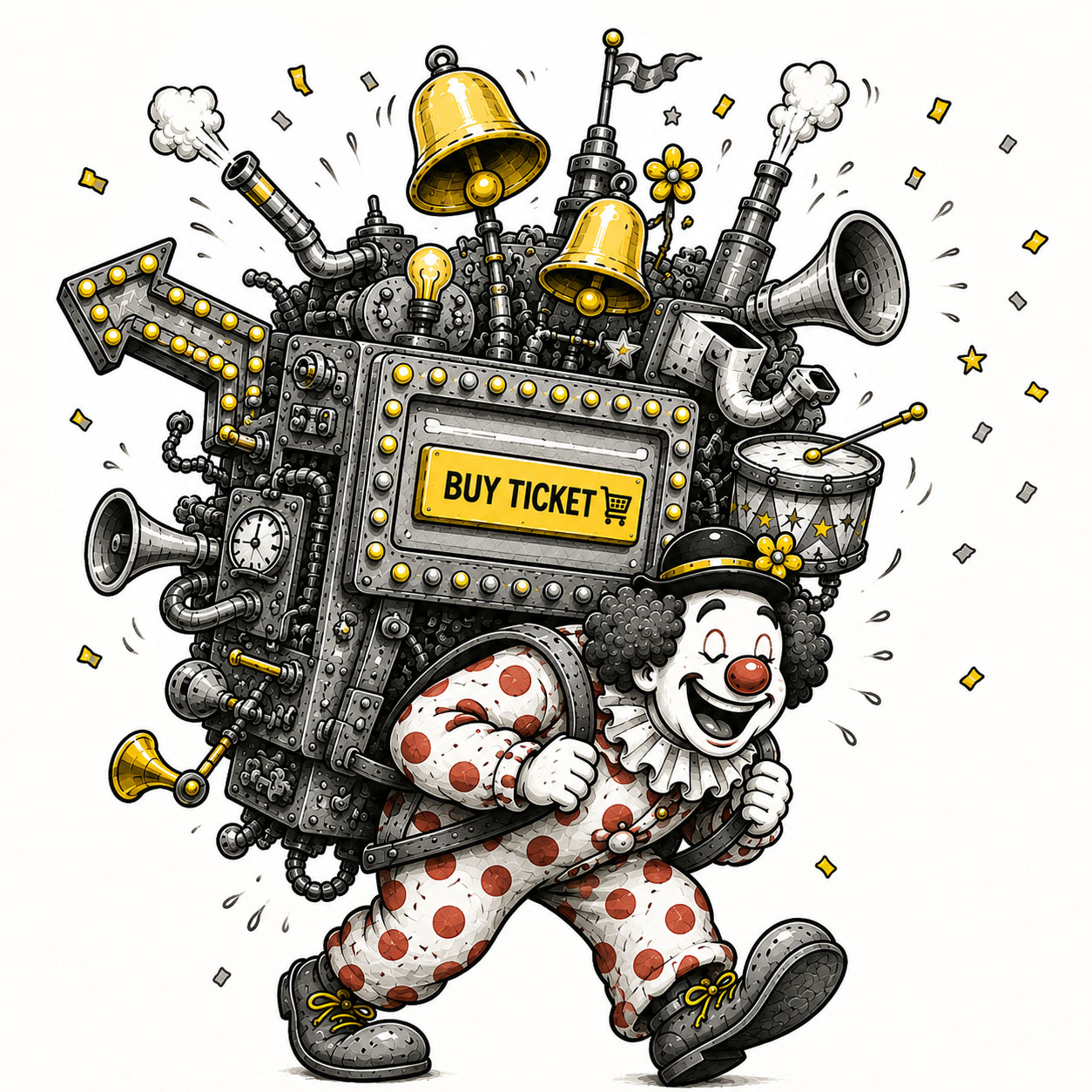
Bells and Whistles are non-essential, flashy features or embellishments that enhance a product’s appeal but aren’t required for its core functionality.
Sometimes they add delight, personality, or immersion. But when overused, they can obscure core user needs, increase complexity and cognitive load, and ultimately reduce usability.
In UX design, Bells and Whistles may include elaborate animations, unnecessary 3D effects, decorative widgets, or complex customization options. They make the interface sparkle, the interactions feel fancy, and the feature list sound exciting – but do little to improve the core experience.
ORIGIN
The phrase bells and whistles comes from early mechanical devices such as fairground organs that added literal bells, whistles, and drums to attract attention and crowds. Over time, it became shorthand for non-essential features added for show rather than function.
The expression came to describe extras intended to dazzle, attract attention, or make something appear more sophisticated without being necessary for its primary purpose.
In software and product design, it describes decorative enhancements, gimmicks, and secondary features that create the impression of sophistication without improving usability. As computer scientist Niklaus Wirth famously observed, software tends to grow in complexity faster than it grows in usefulness – often driven by the belief that more features and embellishments equal better products.
WHEN
You’ve encountered Bells and Whistles when:
- New features don’t support the core task
They demonstrate what the product can do without helping users do what they came to do.
- Effects attract more attention than the content
Animations, transitions, and visual treatments become the experience instead of supporting it.
- The interface feels “cool” but becomes harder to use
Users admire the interaction immediately before wondering how to complete their task.
- Most of the available functionality goes unused
The feature list keeps growing. User behavior remains considerably more selective.
- Customization creates complexity instead of control
Users receive seventeen ways to configure something they hoped would simply work.
- You hear: “This would be a nice touch.”
It might be. The important question is whether the product needs touching.
WHY
Bells and Whistles are driven by temptation and often manifests in the following:Desire to impress
Flashy features and effects can create the impression of innovation, even when the underlying experience remains unchanged.
- Stakeholder influence
Extras get added to satisfy requests, demonstrate capability, or make the product appear more competitive.
- Misunderstood value
More features can feel like more usefulness, even when they create more complexity than benefit.
- Lack of focus
Without a clearly understood core purpose, almost every new idea can appear worth adding.
- Fun over function
Adding polish, animation, and clever interactions can be considerably more enjoyable than solving difficult structural problems.
HOW
Preventing Bells and Whistles doesn’t mean doing less. It means making sure new features and embellishments earn their place. Follow these steps for a better outcome:
- Define the core job clearly
Understand the primary thing the product must help users accomplish well.
- Evaluate every addition against that goal
Ask how a proposed feature, interaction, or embellishment improves the core experience. If it doesn’t help, reconsider whether it belongs.
- Prioritize usefulness over impressiveness
A clever interaction isn’t automatically a useful interaction. Clarity should come before flair.
- Remove what doesn’t earn its place
Every additional element introduces some amount of visual, cognitive, technical, or maintenance cost.
- Use restraint as a feature
Not everything needs to move, animate, expand, customize, respond, sparkle, or make a noise when clicked.
PRO TIP
Good design isn’t about how much you can add, it’s about how much you can leave out. If a UI elements only exists to impress, question whether it belongs.
EXAMPLES
- A simple workflow overloaded with animations and transitions
- A clean interface filled with decorative widgets and effects
- Features added for completeness but rarely used
- Interactions that feel clever but slow users down
- A product demo that dazzles – but doesn’t translate to real use
CONCLUSION
Bells and Whistles don’t necessarily break products immediately. Some may even make an experience more delightful.
The problem begins when embellishment competes with purpose. Every additional feature, animation, effect, control, and customization option demands attention. What feels sophisticated, starts to distract users, slows them down, and may eventually reduce task completion rates.
The challenge in design isn’t resisting ideas. There is rarely a shortage of good ideas. It’s resisting the unnecessary ones. In the long run, being effective matters more than being impressive.
If your product already does its job beautifully, it may not need another bell. Or whistle.