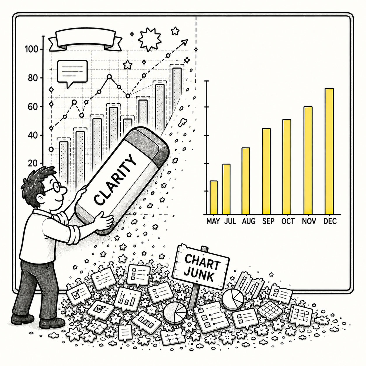
Data ink refers to the ink (or pixels) that represents the actual data in a visualization. The Data-Ink Ratio measures the proportion of ink used to represent data compared to the total amount of ink used in the graphical presentation, including non-data elements.
In visual design, it is therefore essential to prioritize increasing the data-ink ratio by utilizing data ink exclusively and minimizing or eliminating non-essential ink. By doing so, the focus remains on the data rather than unnecessary or decorative design elements such as gradients, shadows, borders, labels, widgets, or enthusiastic gridlines.
ORIGIN
The concept of the Data–Ink Ratio was introduced by statistician and information-design pioneer Edward Tufte in his influential 1983 book The Visual Display of Quantitative Information.
Tufte argued that statistical graphics should devote as much of their visual presentation as possible to communicating the data itself. His guiding principle was famously simple: “Above all else show the data.”
Tufte was particularly critical of excessive decorative treatment, which he popularized under another memorable term: chartjunk.
The idea later expanded beyond charts into dashboards, interfaces, and maps, where every pixel competes for attention.
WHEN
You’ve encountered a low Data–Ink Ratio when:
- The chart has more styling than substance
Three data points have somehow acquired gradients, shadows, borders, icons, and their own visual identity system.
- Gridlines become the visualization
The data is technically still there, somewhere behind the graph paper.
- Containers contain containers
Cards inside panels inside sections inside another beautifully rounded rectangle.
- A dashboard feels busy but says very little
There are twelve widgets and approximately three useful pieces of information.
- A map contains everything except a clear message
Roads, buildings, labels, boundaries, terrain, points of interest, parcels, transit, and your actual data fighting bravely in the middle.
- Every element has equal visual weight
Nothing is technically hidden. Nothing is particularly visible either.
- You hear: “Let’s make it pop.”
The data quietly begins packing its belongings.
WHY
Low Data–Ink Ratio usually stems from good intentions, but it’s often difficult to spot and comes disguised in the following situations:
- Decoration feels informative
More visual treatment can create the impression that more design has occurred, even when comprehension hasn’t improved.
- Tools provide generous defaults
Charting libraries, dashboard builders, and design tools happily provide borders, axes, labels, legends, backgrounds, and effects whether you need them or not.
- Whitespace feels unfinished
Empty space can make teams nervous. Filling it feels productive.
- Everything wants attention
Stakeholders want their metric emphasized. Designers want hierarchy. Marketing wants branding. The alert wants red. Eventually everybody gets what they asked for.
- Context overwhelms content
Maps are especially vulnerable. Basemaps, roads, labels, boundaries, controls, legends, pop-ups, and layers all provide useful context – until there’s so much context nobody can see the subject.
- Removing feels riskier than adding
Adding another label seems helpful. Removing one requires deciding that users don’t need it.
HOW
The goal is to achieve a ratio as close to 1.0 as possible, maximizing information density. That doesn’t mean you should remove design elements, it means to remove unnecessary competition.
Achieve a high data-ink ratio by following these steps:
- Start with the question
Determine what users need to understand before deciding how much information to display.
- Remove non-essential visual weight
Reduce heavy borders, shadows, backgrounds, gridlines, and decorative effects that don’t improve comprehension.
- Let supporting elements recede
Axes, grids, labels, legends, and controls can remain useful without becoming the most visually prominent elements.
- Simplify the basemap
For thematic maps, the basemap should usually provide context rather than competition. Reduce unnecessary labels, detail, contrast, and color where appropriate.
- Show information when it becomes relevant
Use progressive disclosure, filtering, zoom levels, scale-dependent rendering, and interaction rather than presenting everything simultaneously.
- Prioritize layers intentionally
Not every dataset needs equal contrast. Establish a visual hierarchy between the subject, supporting context, and background information.
- Use whitespace deliberately
Whitespace isn’t unused space. It separates information, creates hierarchy, and gives attention somewhere to land.
PRO TIP
The goal is not minimalism for its own sake – the goal is to provide clarity. A perfectly minimal chart nobody can read is just minimalist confusion with excellent typography. If you can remove an element without removing meaning, the visualization may be better without it.
EXAMPLES
Examples of poor data-ink ratio include the following:
- A chart where heavy gridlines are more visually prominent than the data.
- A dashboard filled with decorative cards, gradients, shadows, and borders around relatively little information.
- A thematic map where the basemap competes with the actual phenomenon being mapped.
- A visualization where every series uses equally strong colors, labels, and symbols, leaving no meaningful hierarchy.
- A mobile map where toolbars, widgets, legends, and controls consume more screen space than the map itself.
- A dashboard simplified by removing decorative elements until the important numbers become obvious without additional emphasis.
CONCLUSION
The Data–Ink Ratio pattern is a reminder that clarity comes from restraint. Every extra line, color, label, or effect demands attention from the user – and as we know, attention is limited.
Great visualizations don’t remove personality, they remove distraction. In the end, users rarely remember how decorative the interface was. They remember whether they found what they were looking for, understood the content, or were able to solve their problem.
If the data does the work, the interface will take the credit.