Pixel peeping refers to the obsessive examination of a design at an extreme level of detail, scrutinizing every pixel, alignment, or color value, sometimes to the detriment of the bigger picture. It’s when designers zoom all the way in and get stuck fussing over tiny visual details that most users will never notice.
ORIGIN
The term comes from photography, where enthusiasts “pixel peep” by zooming all the way in on a high-resolution image to evaluate sharpness or noise at a microscopic level.
In UX and product design, it describes a similar tendency to over-focus on minute imperfections while ignoring larger usability or experience problems.
WHEN
You’ll encounter pixel peeping when:
- Reviewing high-fidelity mockups late in the process.
- Stakeholders nitpick over padding, corner radii, or icon weight.
- Teams delay launch because “the gradients aren’t perfect yet.”
- Design reviews devolve into debates over 1–2px alignment.
It’s particularly common in detail-oriented cultures, or when the team is nervous about how the product will be perceived.
WHY
Pixel peeping happens because designers care about craft, and stakeholders want things to “look right.” Attention to detail does matter for polish and professionalism, but overemphasizing it can distract from usability, accessibility, and business impact. Users are much more likely to notice a broken flow than a misaligned button.
HOW
Here’s how to manage pixel peeping:
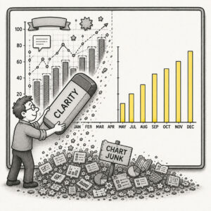
- Prioritize impact. Fix the issues that affect usability and perception first.
- Set thresholds. Decide what level of polish is “good enough” for the current release.
- Bundle refinements. Collect minor tweaks into a single polish phase instead of letting them derail progress.
- Educate stakeholders. Explain that perfect pixels don’t compensate for broken experiences.
- Zoom out. Periodically step back and view the design at the intended size and context.
PRO TIP
When reviewing, view the design at 100% scale and on target devices, many perceived “flaws” vanish at real-world sizes.
EXAMPLES
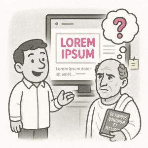
- Spending a day adjusting a 2px misalignment that no user would notice.
- Endless feedback loops over whether a shade of blue should be #2176FF or #2075FE.
- Holding back a release because someone noticed that one icon feels “a little heavy.”
CONCLUSION
Pixel peeping reminds us that craft and care are important, but not at the expense of momentum or the overall user experience. Don’t lose the forest for the trees.
Also known as: Pixel perfect obsession • Polishing the apple • Bike shedding (when detail debates replace meaningful progress)