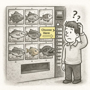
Empty Fridge Syndrome describes the disappointing experience users have when they first open a newly installed app or sign in to a new product, only to find… nothing. No data, no guidance, no value. Just an empty, cold interface waiting for them to figure out what to do next. The app looks polished from the outside, but when you “open it up” (the fridge), it’s empty or filled with placeholders.
ORIGIN
The metaphor comes from the feeling of opening your fridge expecting to find something delicious, only to see bare shelves and an old bottle of mustard.
In UX, it refers to the barren state of an app or dashboard before users have added content, completed setup, or generated any activity. This first impression can feel unwelcoming, confusing, or even discouraging, leading some users to abandon the product entirely.
WHEN
You’ll see Empty Fridge Syndrome when:
- A dashboard has no default data or helpful suggestions for first-time users.
- A photo-sharing app shows an empty grid with no guidance after signing up.
- A reporting tool presents a blank screen instead of sample charts or onboarding.
- A project management tool opens to an empty board with no templates or hints.
It’s particularly common in SaaS products, social apps, and analytics tools where value depends on user-generated data.
WHY
Empty Fridge Syndrome happens because teams focus on what the product looks like once it’s filled with data, forgetting that first-time users don’t have any yet. It reflects an inside-out mindset, assuming users already know how to use the product and what’s possible. But first-time experiences are critical for retention, and a blank screen sends the wrong message: “Good luck figuring it out!”
HOW
Here’s how to avoid Empty Fridge Syndrome:
- Seed the fridge. Show sample data, demo content, or pre-filled examples to illustrate what’s possible.
- Guide the first step. Use onboarding to direct users to their first meaningful action.
- Celebrate progress. Reinforce even small user contributions to start filling up the fridge.
- Hide irrelevant UI. Don’t overwhelm users with empty sections they can’t use yet.
- Test onboarding. Watch real users’ first sessions and refine based on where they get stuck.
PRO TIP
Use progressive disclosure: reveal features and content gradually as users engage, rather than dumping them into an empty but fully exposed interface.
EXAMPLES
- A to-do app showing a pre-filled example list (“Buy milk, Call Mom, Walk the dog”) to spark ideas.
- A photo gallery app prompting users to import photos with a big, clear CTA rather than showing a blank grid.
- A data dashboard offering sample reports and a checklist for connecting real data sources.
CONCLUSION
Empty Fridge Syndrome reminds us that the very first experience users have is make-or-break. Welcome them with something, even a snack, so they feel at home and ready to engage.
Also known as: Blank slate • Empty state failure • The cold start problem (in a broader sense)