A Red Herring is a misleading or distracting element that pulls attention away from what actually matters.
In UX, it can be accidental such as a design element that looks like it does the thing but doesn’t, something that distracts users from their primary goal or leads them toward the wrong conclusion. But it can also be intentional, such as a deliberate distraction used to test attention or a research question to validate that users don’t rush through the study.
ORIGIN
There isn’t actually a fish species called “red herring”. The term refers to heavily cured or smoked fish, typically herring. Throughout the curing process the flesh turns reddish and develops a particularly strong and pungent smell.
While there are multiple origin stories dating back to as early as the 14th century, the figurative meaning of “red herring” as a distraction or false trail is attributed to an 1807 story by journalist William Cobbett. In this Political Register article, Mr. Cobbett claimed he once used a red herring to throw hunting dogs off their trail – criticizing how the English press had misled in reporting Napoleon’s defeat.
Over time, the phrase evolved to describe anything that distracts or diverts attention. It is used in storytelling to deliberately mislead the audience and in research to test participant attentiveness. In interface design a red herring usually describes unintentional design flaws.
WHEN
You’ve encountered a Red Herring in UX when:
- A visual looks clickable but isn’t.
- A link or menu item leads somewhere unexpected.
- A button label suggests one outcome but performs another.
- An unnecessary step interrupts a simple flow.
- Users are distracted by something that looks important but isn’t.
If users hesitate, backtrack, or say, “Wait… what does this do?” – and if it smells fishy – you may have encountered a red herring.
WHY
Red Herrings emerge when signals and intentions fall out of sync. Users will always follow what stands out – not what you meant.
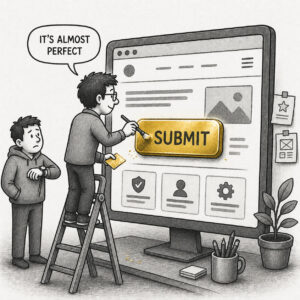
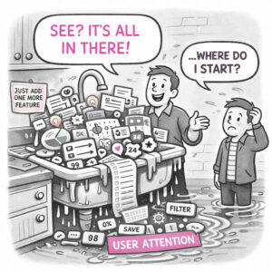
In design, this usually isn’t malicious, it’s the byproduct of trying to do too much at once. A visual gets emphasized because it looks good, not because it matters. A label sounds right, but doesn’t quite match the outcome. A feature gets added to satisfy a request, not a user need. Over time, these small misalignments compound, and users start following the wrong cues.
Some common reasons for red herrings include the following:
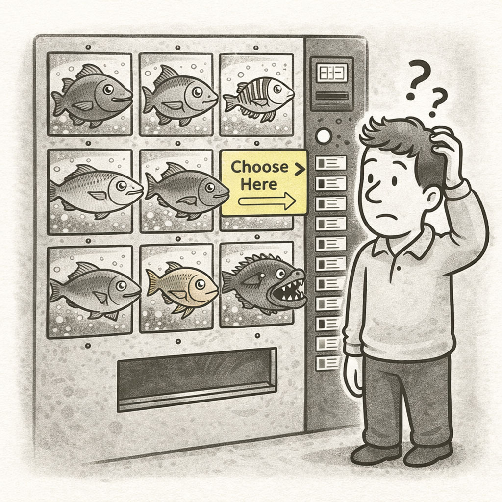
- Misleading affordances: Looks interactive but isn’t
- Weak hierarchy: Visual importance doesn’t match actual importance
- Overdesign: Decoration competes with function
- Unclear intent: Words, visuals, and actions don’t align
In research, however, the same concept can be flipped on purpose. A Red Herring becomes a signal check – a way to ensure participants are paying attention and not rushing through. The goal isn’t to mislead, but to validate trust in the data.
HOW
Dealing with Red Herrings starts with understanding that attention is a limited resource and design controls where it goes.
In interfaces, the goal is elimination. Every element should earn its place, and more importantly, its level of emphasis. If something looks important, it must be important. If something looks interactive, it must respond. The experience should feel coherent, where visuals, labels, and behaviors all reinforce the same message.
A good way to uncover Red Herrings is to observe where where they initially commit their attention. That first move often reveals what your design is unintentionally signaling. Apply the following principles:
- Align visual weight with true priority
- Ensure affordances match behavior
- Reduce or remove competing distractions
- Test for first-click accuracy and hesitation
In research, red herring’s can be used sparingly to detect inattentive responses. They must be subtle, respectful, and never undermine the participant’s trust. Follow these rules:
- Blend naturally into the survey flow
- Keep it clever, not obvious
- Use sparingly; one is usually enough
- Pair with other quality signals (time, consistency)
PRO TIP
Identify elements that distract or are consistently used incorrectly. Remove or change until behavior pattern have improved.
Remember: what you emphasize becomes the path users follow.
EXAMPLES
In UX (accidental):
- A card that looks clickable but isn’t
- A primary button that does something secondary
- A map marker that looks important but represents nothing actionable
- A flashy chart that distracts from the real insight
In Research (intentional):
- A fake brand in a list of real ones
- An answer option that makes no logical sense such as ‘dog’, ‘cat’, ‘roof’, ‘mouse’.
CONCLUSION
A Red Herring is a misdirection of attention. Sometimes it’s a bug, other times it’s a tool. But in both cases, it reveals the same truth: Users follow signals, not intentions.
Design carefully what you make visible… because they will follow the smell.