Data ink refers to the ink (or pixels) that represents the actual data in a visualization. The Data-Ink Ratio measures the proportion of ink used to represent data compared to the total amount of ink used in the graphical presentation, including non-data elements.
In visual design, it is therefore essential to prioritize increasing the data-ink ratio by utilizing data ink exclusively and minimizing or eliminating non-essential ink. By doing so, the focus remains on the data rather than unnecessary or decorative design elements such as gradients, shadows, borders, labels, widgets, or enthusiastic gridlines.
ORIGIN
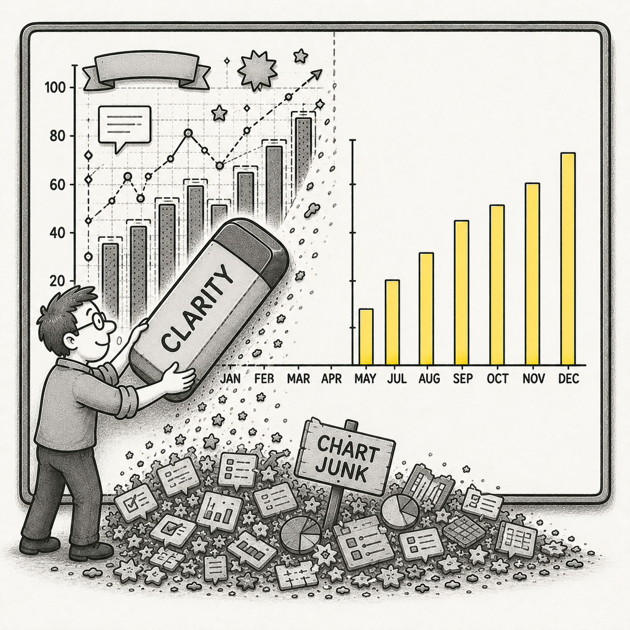
The data-ink ratio concept was introduced by American statistician and professor Edward Tufte in his seminal 1983 book, The Visual Display of Quantitative Information. Tufte’s philosophy was to “above all else show the data” and he famously criticized excessive visual embellishment as “chart junk” – unnecessary visual noise that competes with the signal and should be removed wherever possible.
The idea later expanded beyond charts into dashboards, interfaces, and maps, where every pixel competes for attention.
WHEN
You’ve encountered a low Data–Ink Ratio when:
- A chart has more styling than substance
- Gridlines dominate the data itself
- Labels, borders, shadows, and widgets compete for attention
- A dashboard looks visually busy but communicates little
- A map is so detailed that users can’t find what matters
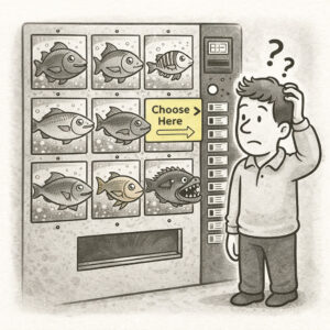
- Someone says: “Let’s make it pop more”
If the interface feels louder than the information, the ratio is off.
WHY
Low Data–Ink Ratio usually stems from good intentions. It’s often difficult to spot and comes disguised in the following situations:
- Decoration feels informative: More visual structure creates the illusion of clarity.
- Tools encourage clutter: Default styles include gradients, borders, shadows, and labels automatically.
- Teams fear emptiness: Whitespace feels unfinished, even when it improves comprehension.
- Everything competes equally: Without hierarchy, every element demands attention at the same time.
In maps and dashboards, this becomes especially dangerous. Modern interfaces already contain significant UI overhead – panels, controls, filters, legends, pop-ups, labels, and basemaps all consume attention before the actual data even appears.
As a result, signal becomes noise.
HOW
The goal is to achieve a ratio as close to 1.0 as possible, maximizing information density. That doesn’t mean you should remove design elements, it means to remove unnecessary competition.
Achieve a high data-ink ratio by following these steps:
- Start with the question: What does the user actually need to see?
- Reduce non-essential visual weight: Borders, shadows, heavy gridlines, and decorative effects should support the data – not compete with it.
- Simplify the basemap: In maps, the basemap should usually recede into the background. Light gray, dark gray, or simplified basemaps often communicate better than highly detailed imagery.
- Hide what isn’t immediately useful: Not every layer, label, or widget needs to be visible at once.
- Use scale dependency and progressive disclosure: Show detail only when it becomes relevant.
- Let hierarchy do the work: Important information should stand out naturally – not by making everything loud.
- Use whitespace intentionally: Whitespace is not wasted space. It is breathing room for understanding.
PRO TIP
The goal is not minimalism for its own sake – the goal is to provide clarity. A perfectly minimal chart nobody can read is just minimalist confusion with excellent typography. If an element can be remove without removing meaning, then this is probably the better interface.
EXAMPLES
Examples of poor data-ink ratio include the following:
- A dashboard filled with decorative cards, gradients, and shadows
- A chart where the gridlines are more visible than the data
- A map overloaded with labels, layers, and colorful symbology
- A visualization where every element screams equally loudly
- A mobile map where controls consume half the screen
CONCLUSION
Data–Ink Ratio is a reminder that clarity comes from restraint. Every extra line, color, label, or effect asks the user for attention – and as we know, attention is limited.
Great visualizations don’t remove personality, they remove distraction. Because in the end, users rarely remember how decorative the interface was. They remember whether they understood it.
If the data does the work, the interface will take the credit.