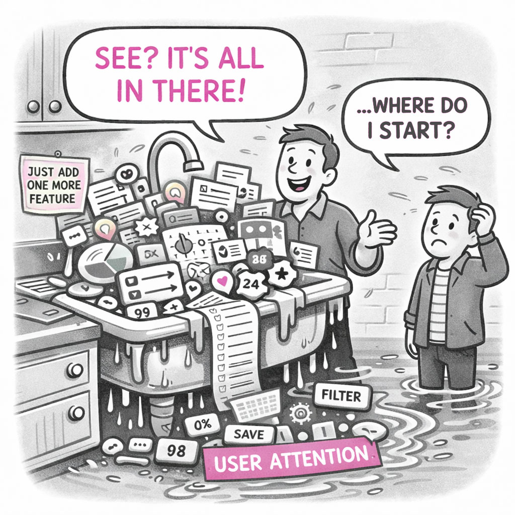
The Kitchen Sink is what happens when an app – or a map – tries to show everything and ends up explaining nothing.
At first glance, it looks impressive. Packed. Comprehensive. Full of features, layers, and information. But spend more than a few seconds with it, and the experience quickly shifts from insight to overload. The eye jumps. The interface competes for attention. The meaning gets buried somewhere between panels, controls, and colors. The Kitchen Sink is not a failure of effort. It is a failure of prioritization.
ORIGIN
The term Kitchen Sink comes from the idiom “everything but the kitchen sink”, meaning to include almost everything imaginable.
The phrase dates back to the late 19th century, when it originally appeared as “everything but the kitchen stove.” By the early 20th century, it evolved into the “sink” version – likely because the phrasing was more rhythmic and memorable. A 1918 newspaper already described people fleeing with “everything but the kitchen sink.” The expression gained wider popularity during World War II, where it was used to describe overwhelming, all-out efforts – throwing everything possible at a target.
After the war, the phrase transitioned into business and product thinking, where it came to represent the tendency to include every possible feature or option.
In modern UX, the Kitchen Sink appears both as a tool (pages that showcase all components) and as an anti-pattern – interfaces that try to include everything, and in doing so, lose clarity.
WHEN
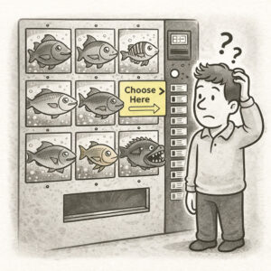
A clear tell-all moment to identify a Kitchen Sink is when the interface or map requires explanation before it can be used. Furthermore, you’ll encounter the Kitchen Sink in apps or maps when:
- You hear: “We just need to show all of this”
- Every feature or dataset is included “just in case” and with their own distinct, vibrant color
- Screens are filled with panels, controls, layers, and widgets
- Stakeholders want their functionality visible at all times or their data to “stand out more”
If the app or map looks visually exciting but mentally exhausting – and it feels like everything went down the drain – then you ran into a case of a kitchen sink.
WHY
The Kitchen Sink isn’t caused by bad design – it’s caused by avoided decisions. At its core is a lack of prioritization. Teams struggle to decide what matters most, so they choose everything. Instead of hierarchy, they default to inclusion.
A few common drivers include the following:
- Stakeholder accumulation: Each feature represents a request, a team, or a priority. Removing something feels political, so everything stays.
- Fear of omission: Teams worry that leaving something out reduces value. So they include everything “just to be safe.”
- Misunderstood completeness: More features feel like more value. In reality, too much reduces clarity and increases cognitive load.
- Tool temptation: Modern platforms make it easy to add layers, panels, filters, and controls. The cost of adding is low – until the experience breaks.
In trying to include everything, the product stops communicating anything clearly.
HOW
The Kitchen Sink is built incrementally.
A few features become several. Several become many. Each one adds visual and cognitive weight – through buttons, panels, layers, filters, and interactions.
Nothing is quiet. Nothing recedes. The interface becomes dense. The navigation expands. The user starts scanning instead of understanding.
Eventually, users stop exploring and start filtering – mentally hiding what they don’t need just to get through the experience. And the designer? Still confidently saying: “But everything is there.”
PRO TIP
If everything is important, nothing is. Design for clarity, not completeness. Follow these basic rules for better results:
- Prioritize what matters most
- Remove or hide non-essential features by default
- Use progressive disclosure (show more only when needed)
- Group related functionality instead of exposing everything
- Let secondary elements recede into the background
EXAMPLES
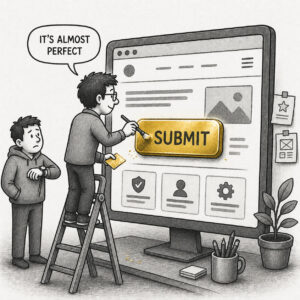
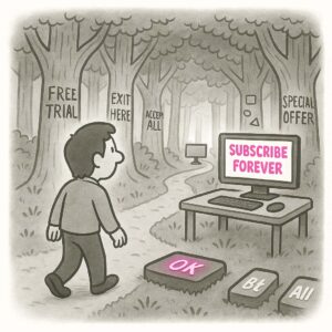
A classic Kitchen Sink moment is when a stakeholder says, “This has everything we need.” Users, meanwhile, don’t know where to start.
Other examples:
- A GIS dashboard with every available layer turned on by default
- An app screen with charts, filters, maps, tables, and alerts all visible at once
- A toolbar packed with icons, each equally prominent
- A settings panel with dozens of toggles exposed upfront
- A legend or menu that requires scrolling, zooming, or patience
CONCLUSION
The Kitchen Sink is a reminder that inclusion is not the same as clarity. A good product makes decisions for the user. It highlights what matters and lets everything else support that experience.
A Kitchen Sink does the opposite. It asks the user to figure out what matters on their own. And most won’t.