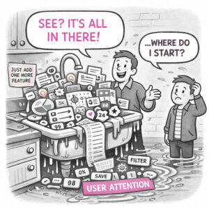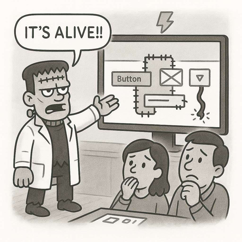
Frankenstein design refers to a user interface or experience that feels stitched together from mismatched parts, often inconsistent in style, behavior, and purpose. It happens when components, patterns, or ideas from different sources are cobbled together without a coherent vision, resulting in a product that “works,” but feels awkward, confusing, or even unsettling.
ORIGIN
The term comes from the 1931 Universal film “Frankenstein”, based on Mary Shelley’s novel Frankenstein, where the makeup artist Jack Pierce gave the creature its iconic flat, scarred head and neck bolts, and the body is assembled by body parts from different people. Although it’s alive, the creature is unnatural and disturbing, a metaphor for design that lacks harmony or identity because it’s assembled from disconnected parts.
In UX, Frankenstein design often arises when teams prioritize speed or compromise over cohesion, leaving users to experience the disjointed results.
WHEN
You’ll most often see Frankenstein design when:
- A product evolves over time without a design system or clear guidelines.
- Multiple teams contribute components independently, without coordination.
- Stakeholders insist on reusing pieces from unrelated products.
- Features are bolted on in response to requests, rather than designed holistically.
- Deadlines force patchwork solutions instead of thoughtful ones.
It’s particularly common in legacy systems, MVPs, and products that have gone through frequent pivots.
WHY
Frankenstein design usually emerges from good intentions, teams want to ship quickly, reuse what already exists, or accommodate competing priorities. But without someone advocating for consistency and user experience, the result is often a messy, jarring interface that confuses users and undermines trust. Consistency builds confidence. Inconsistency forces users to stop and figure things out.
HOW
Here’s how to avoid or fix Frankenstein design:
- Establish a design system. Define visual and interaction standards to guide all contributors.
- Audit regularly. Identify inconsistent patterns and plan to clean them up.
- Centralize design decisions. Empower a design leader or small group to ensure coherence.
- Refactor over time. Dedicate time each sprint to pay down design debt.
- Educate contributors. Help engineers and stakeholders understand the cost of inconsistency.
PRO TIP
When reviewing a product, look at it through fresh eyes, pretend you’re a new user and note where the experience feels inconsistent or confusing. Those are often signs of Frankenstein design.
EXAMPLES
- A dashboard that uses three different button styles, four modal types, and inconsistent typography.
- An e-commerce site with a checkout flow borrowed from another brand, a product page from a template, and a homepage designed by a freelancer, all mismatched.
- A mobile app where every new feature looks and behaves differently because it was developed by different teams over time.
CONCLUSION
Frankenstein design reminds us that every part of a product should feel like it belongs, not just technically, but emotionally, visually, and functionally. Users notice when it doesn’t.
Also known as: Patchwork UI • Hodgepodge design • Design by committee (in extreme cases)