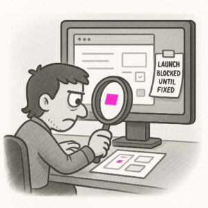
Mullet UI refers to an interface that’s all “flash and show” up front, but clunky, outdated, or neglected in the back. In other words: “Business in the front, party in the back”, just like the infamous haircut. It’s a design that impresses users initially with a sleek homepage or landing screen, but quickly reveals poor usability, inconsistency, or a lack of care deeper in the experience.
ORIGIN
The metaphor comes from the mullet hairstyle popular in the ’80s and ’90s: neat and professional in the front, long and wild in the back.
In UX, Mullet UI emerged as a tongue-in-cheek way to describe designs where the surface layer has been polished for marketing purposes, while the rest of the product remains messy and outdated.
WHEN
You’ll encounter Mullet UI when:
- A homepage or hero screen has stunning visuals, but subsequent pages use dated patterns.
- A flow starts with a shiny, animated onboarding but dumps users into an old dashboard.
- Redesign efforts focus only on the “top” layer of the app, leaving core workflows untouched.
- A mobile app looks modern but opens clunky, unresponsive web views for secondary tasks.
It’s particularly common in legacy products that have been partially redesigned, or when redesign budgets only cover the “visible” parts of a product.
WHY
Mullet UI happens because teams often prioritize the parts of the product that get the most attention, like marketing pages or the signup flow. It also reflects resource constraints: polishing the entire experience takes time and money, so secondary screens and workflows get left behind. But users notice the inconsistency, and it undermines trust and satisfaction.
HOW
Here’s how to avoid Mullet UI:
- Audit end-to-end. Review the entire experience, not just the main screens, for consistency.
- Design systems. Use a shared design system to ensure cohesion throughout.
- Prioritize workflows. Redesign critical user tasks, not just the surface layer.
- Plan iterations. If you can’t fix everything at once, create a clear roadmap to modernize the back.
- Test thoroughly. Observe users navigating beyond the homepage to catch weak spots.
PRO TIP
Even if your full redesign is staged over time, communicate the plan to stakeholders and users to set expectations and build trust.
EXAMPLES
- A slick SaaS landing page leading to a dashboard full of outdated UI components.
- A shopping app with a modern product page but a clunky, multi-step checkout flow.
- A banking app where the home screen looks fresh, but transfers and statements feel like a portal from 2005.
CONCLUSION
Mullet UI reminds us that great UX doesn’t stop at the hero section. Users don’t just visit; they live in your product. Make sure the back feels as good as the front.
Also known as: Lipstick on a pig (a bit harsher) • Facelift UI • Surface polish


