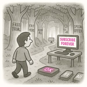
Dribbblization describes a design trend where interfaces prioritize aesthetic polish and flashy visuals over usability, clarity, and real-world context, often inspired by the kind of mockups shared on design showcase platforms like Dribbble. It’s when designs look amazing in a static shot but fall apart when used.
ORIGIN
The term comes from Dribbble, the popular online community where designers share beautiful, high-fidelity visuals. While great for inspiration and craft, Dribbble tends to favor highly polished, conceptual work, sometimes at the expense of practicality or accessibility.
In UX, Dribbblization warns against designing products to impress other designers, instead of meeting the needs of actual users.
WHEN
You’ll notice Dribbblization creeping in when:
- Mockups feature excessive gradients, micro-interactions, or unrealistic typography that don’t scale to real data.
- Stakeholders get excited about “modern” designs they’ve seen on showcase sites without testing usability.
- Designs look amazing at 1440px wide on a pristine screen but fail on mobile or with real user content.
- The team obsesses over glossy visuals while ignoring research findings.
It’s particularly common in early-stage startups, portfolio projects, or redesigns that aim to “wow” rather than solve problems.
WHY
Dribbblization happens because it feels good to impress peers and stakeholders with something shiny. Designers are rightly proud of their craft, and Dribbble culture celebrates pixel-perfect mockups over functional outcomes. But products are for users, not galleries, and users care more about clarity and utility than clever gradients.
HOW
Here’s how to avoid Dribbblization:
- Design in context. Use real-world data and edge cases in your mockups.
- Prioritize usability. Test designs early with real users before polishing visuals.
- Stay accessible. Make sure color contrast, font sizes, and interaction states meet accessibility standards.
- Balance craft and function. Beautiful designs are great if they work.
- Educate stakeholders. Help them understand the trade-offs between visual dazzle and practical UX.
PRO TIP
When showing designs, include both a glossy version and a “real content” version. This keeps everyone grounded and real.
EXAMPLES
- A weather app concept with illegible white text on a stunning sunset background.
- A dashboard mockup that looks elegant in grayscale but becomes cluttered with real user data.
- A signup form designed with ultra-thin, low-contrast fields that look sleek but frustrate users.
CONCLUSION
Dribbblization reminds us that great UX is about more than aesthetics. Aim for designs that don’t just look good on a slide but feel good in the hands of users.
Also known as: Dribbblitis • Dribble Effect • Portfolio-first design • Style over substance